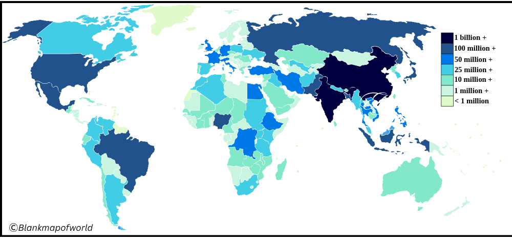
It is useful in terms of locating where people prefer to live, their movement, as well as the growth of cities. It is also possible to learn about such issues, as an excessive number of people in a certain place or a lack of resources in another, by looking at it. The World Population Map can help any citizen who may be curious to learn how the people are distributed in the world.
Related post:
Free World Population Map

A free world population map is an easy-to-understand map that shows where people live around the world. It uses colors to show which countries have more people and which have fewer. For example, countries like India and China are shown in dark colors because many people live there.
Places such as deserts or icy areas are shown in light colors because only some people live there. This map helps us to see where most people are living. Since it is free, no one – such as students, teachers, or curious learners – can use it to learn more about how people are spread across the earth.
Printable Population Map of the World

A printable population map of the world by country is an easy-to-understand map that shows how many people live in every country. Countries with more people, like India, China, or the United States, are shown in dark colors. Countries with fewer people look light on the map. Such a map is helpful to learn about school work, projects, and where people live worldwide. Since it is printable, you can easily keep a copy or use it in orbit. This gives a simple and clear picture of how the world’s population is spread across different countries.
| Country | Population (approx.) | Area (km²) | Continent | Population Density (people/km²) |
|---|---|---|---|---|
| China | 1,425,000,000 | 9,596,961 | Asia | 149 |
| India | 1,430,000,000 | 3,287,263 | Asia | 435 |
| United States | 340,000,000 | 9,826,675 | North America | 35 |
| Indonesia | 280,000,000 | 1,904,569 | Asia | 147 |
| Pakistan | 240,000,000 | 881,913 | Asia | 272 |
| Nigeria | 230,000,000 | 923,768 | Africa | 249 |
| Brazil | 215,000,000 | 8,515,767 | South America | 25 |
| Bangladesh | 175,000,000 | 147,570 | Asia | 1,186 |
| Russia | 144,000,000 | 17,098,242 | Europe/Asia | 8 |
| Mexico | 130,000,000 | 1,964,375 | North America | 66 |
| Ethiopia | 125,000,000 | 1,104,300 | Africa | 113 |
| Philippines | 118,000,000 | 300,000 | Asia | 393 |
| Egypt | 112,000,000 | 1,001,450 | Africa | 112 |
| Vietnam | 100,000,000 | 331,212 | Asia | 302 |
| DR Congo | 105,000,000 | 2,344,858 | Africa | 45 |
| Japan | 123,000,000 | 377,975 | Asia | 325 |
| Germany | 84,000,000 | 357,022 | Europe | 235 |
| Turkey | 86,000,000 | 783,356 | Asia/Europe | 110 |
| Iran | 88,000,000 | 1,648,195 | Asia | 53 |
| Thailand | 70,000,000 | 513,120 | Asia | 136 |
| United Kingdom | 68,000,000 | 243,610 | Europe | 279 |
| France | 66,000,000 | 551,695 | Europe | 119 |
| Italy | 58,000,000 | 301,340 | Europe | 192 |
| South Africa | 61,000,000 | 1,221,037 | Africa | 50 |
| South Korea | 52,000,000 | 100,210 | Asia | 519 |
| Spain | 48,000,000 | 505,990 | Europe | 95 |
| Canada | 39,000,000 | 9,984,670 | North America | 4 |
| Australia | 26,000,000 | 7,692,024 | Oceania | 3 |
| Saudi Arabia | 36,000,000 | 2,149,690 | Asia | 17 |
| Argentina | 46,000,000 | 2,780,400 | South America | 17 |
World Population Map Outline

World Population Map is a simple map that reflects the size and boundaries of each country, where people live. It does not have many details, so it is easy to understand. Countries with more people, like India and China, stand outside, while those with fewer people, such as Greenland or the desert, look empty.

Such a map is helpful for students and anyone who wants to learn how people are spread around the world. This helps us to compare countries and helps to see which areas are more crowded or with less population clearly and easily.
![Blank Map of World [Free Printable Maps]](https://blankmapofworld.com/wp-content/uploads/2025/05/blank-map-logo-1.png)
